26/03/2015

Experiments With Overexposure + Texture


Inspired by Marilyn Manson's use of bright, overexposed shots in his, "I don't like the drugs", music video. I decided to try experimenting with overexposing photographs, whilst also experimenting with looking for and adding texture and capturing movement and anonymity. I created these overexposed shots, by making sure more light than needed to, would enter my lens whilst exposing an image. I did this by opening my shutter for longer and putting my camera on a tripod as well in some cases, I also used a lower aperture to let more light in through the lens and used an ISO of 200, so that my images would have a good amount of quality without noise whilst also being relatively bright. I took these photographs around my house and my method was to simply look for interesting shapes and also use myself, to create some more haunting, faceless photographs.


I experimented a lot with placing objects over my face, that were very light so that they would wash out any detail over my face, creating this surreal effect where you can just see the rest of my body and hair. I really liked this photograph in particular, however I personally found the whiter areas to be too smooth and bright, which is why I've lowered the brightness in all my images to bring more detail back into the darker areas. I have also added a grainy texture to this image, which I think really adds to this photograph and communicates the same effect as a lot of the visuals in the Manson video and also the cursed tape I looked at from The Ring, in terms of this haunting use of texture and colours such as white noise.


What I love about this overexposed effect is the amount of negative space it can create, in what would normally be a very busy and detailed image. The image above for example, that I took by pointing my camera at a piece of metal, creates this really abstract reflection of me holding my camera and this bright, negative space looks very surreal in suspending this reflection within the image. I think the rule of thirds is also used effectively in this image, as I don't think having this reflection exactly in the middle would have done anything visually for this image and it would not have allowed the viewer's eye to view across the image as their attention will have just been drawn straight to middle. I also think this works because my intention with this image was not to simply take a photograph, of myself taking a photograph, but to create an abstraction using this effect of overexposing a photograph.

For the image above, I decided to move my camera as I took the photograph, so that the round shapes on my subject matter which was a radiator, would blend and look like they are moving in the image. I think doing this was effective in creating something very smooth in texture and surreal looking, as I don't think a lot of people would instantly know this is a radiator. I also framed my subject matter on the bottom left of the image, cropping a lot of it out, because I really like the negative space around it and I think this framing is interesting in challenging the scale of this object and what it actually is for a viewer, working on this whole idea of the abstraction that I can create within a still life photograph. 

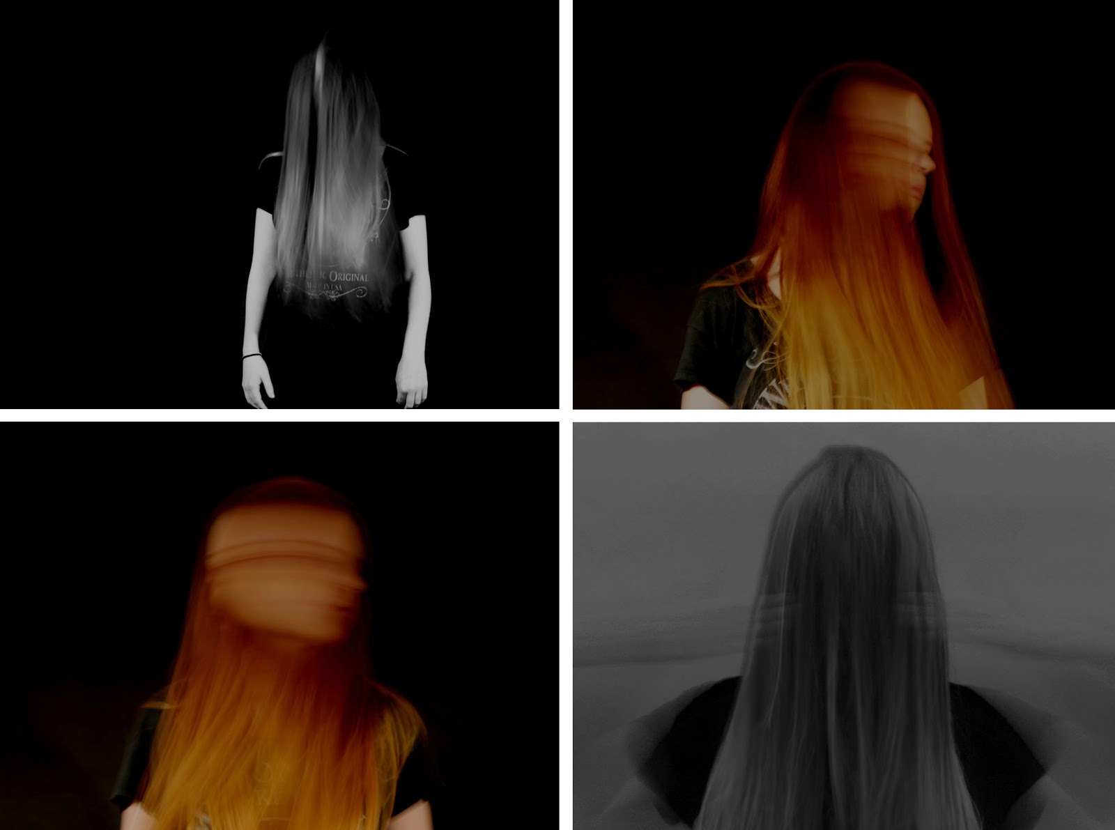
After experimenting with hair previously, inspired by stills from The Ring, I decided to look at hair once again and experimented with what other abstractions I could create, simply using the hair on my head. I experimented in particular with movement and framing in an attempt to create some very surreal looking effects using longer shutter speeds, to capture movement in my image as well as overexposing it. I also decided not to include my face in anyway, in order to create some strange shapes rather than anything particularly emotive. 

This image is one of my favourite results of my experiments with hair and movement, as it just looks so strange and almost like some kind of unworldly creature swimming, through this white space. I also like the varying tones throughout the image, that really add an atmospheric sense of depth to this image, despite everything looking so soft and blending seamlessly into this negative space.


I also experimented with these thick black wires in some of my images, as I love the deep black contrast they add, to an otherwise white and bright image. By bleaching all the other textures and tones mostly out of the image they really look bizarre hanging in and out of the images, in a very intimidating way.

Overall I'm really happy with these experiments. that I have simply gone around my house and taken. I'd love to display some of these images along with my final piece, as I think they have such an emotive mood to them, despite being simple abstractions and really represent a lot of the work and ideas, I have looked at in this project so far, in terms of distortion, black and white and abstraction in general to communicate something very conceptual. I now want to look more at white noise and how I can make a comment on things such as mass media and technology in my work, as I've looked at a lot of work now to do with those themes and definitely would like to work to apply them into my own final images, maybe incorporating these techniques of distortion and overexposing images as well. 

Marilyn Manson "I Don't Like The Drugs" // Music Video Stills


In search of more possible conceptual ideas for my final piece, I decided to start researching art films and music videos, for interesting visuals and deeper messages, that could influence my ideas. As I've been looking at themes of horror and distortion, I decided to look into the music videos of the king of disturbing himself, Marilyn Manson. Due to it's underlying social messages and visuals, that really build on what I've already looked at, I decided to look at stills from the music video, "I Don't Like The Drugs", in order to find more inspiration both visually and conceptually. 


I also decided to look at this music video because Manson makes a great deal of use, out of light and in particular white noise, through these television screens he has tied to his back whilst trying to walk down a street. The lyrics in this video really communicate a clear sense of resentment that Manson has for society and how it raises people. The lyrics "I don't like the drugs, but the drugs like me", I think is Manson using drugs as a metaphor for social institutions like education and religion. Other lyrics in the song make reference to drugs being a metaphor for god and this idea that god is still welcoming to everyone, no matter what you've done and that is what religion pushes.

In terms of the television screens that are weighing down Manson in the still above, I think they represent the constant pull that mass media has on us, in terms of our thoughts and perspective on everything. I think it also challenges this idea of what free will actually means, in a society where we apparently have human rights and the freedom of speech, however we are tightly placed into these social institutions and norms, that take away of lot of our independence and free will, in terms of what religions we are exposed to and the way we are taught and allowed to live our lives. I think the white noise as well that we see on the screens, represents Manson's opinion on how meaningless mass media is in keeping our lives moving along but not actually allowing us to go anywhere.

When Manson was just Brian Warner, as a child he attended a catholic school and this song and many others, really reveals this resentment he feels towards religion, education, family and western culture in general. In terms of this still, where we can see a family gathered around to watch a television show, where we see a headless man in the screen. I think here the reference to drugs is a metaphor for what society gives to those who are part of lower tiers of society, in that Manson believes the everyday person is raised to be stupid and taught to be nothing through these empty television shows and what is passed through the media and social norms that are consecutive to day to day life. Manson uses anonymity here to communicate this much deeper message as we cannot see the faces of any of the subjects in this piece, making us focus on this group as a family, all facing this television screen and what that represents.

The colours used in the video are all very desaturated, which I think was intentional, in order to communicate this idea of society being very soulless and institutionalised, as to me the taking away of colour takes away this sense of life and joy.


In a lot of the video we see many clips of Manson in these very bright, over exposed shots, where he looks deranged and confined. I think this is him commenting further on how mass media and society drives him crazy, with the sense of order and entrapment that it makes him feel. I think this use of overexposing the shot to take away a lot of the detail, that just leaves these bright white and grey shapes, is powerful in conveying this sense of psychological torment Manson feels. I also find this bright white effect, very clinical and minimal, which I think is interesting to see this movement within, as it gives the effect that Manson is struggling within a padded cell. Which again massively relates to this sense of entrapment that he is conveying, in relation to social institutions within our western society that try to control him.

Looking at this video, has inspired me to think more about the use of lighting in my images and the deeper meanings I could communicate through using textures such as white noise and desaturated or even monochromatic colours and also again how I could use anonymity to communicate something very conceptual with my work. The themes of this video have also inspired me to think about how I could make a comment on society and social institutions, such as mass media with my own work.

Experiments With Longer Exposure Times + Distortion


Inspired by the work on distortion and movement I've looked at, such as Francis Bacon's self portraits and film stills from the The Ring, I decided to conduct some experiments to see what I could do with longer shutter speeds and to have my subject moving at the same time. A lot of my inspiration for this, came from the faceless girl that I looked at, from film stills in The Ring. As I really liked the use of anonymity, that was creating through this unsettling way of putting her thick black hair, over her face.

To create these experiments I used the studio in my college, a DSLR camera in the form of the Canon EOS 60D, with a 18-55mm kit lens. I also used a tripod and two lights in front, on either side of my subject, on the lowest brightness. I used a black background so that I could best control the light hitting my subject, as I wanted the subject to blend into the background, rather than stand out of it to a certain extent, so that I would only capture these bright points of focus on her hair and arms in some cases. I also used a tripod in order to keep my camera completely still, while using longer exposure times, so that I had control of the movement I wanted my subject to make, rather than having to move the entire camera.

My main intention with these experiments, was to play around with using shutter speed and different movements with a subject, to create different distortions. I was inspired to do this by the photograph of the teens from The Ring that I looked at, stills of the faceless girl and also the paintings I looked at by Francis Bacon, who used distortion, to communicate emotionally his resentment towards himself and his life. 


For the majority of my favourite experiments, I've edited a colour version of the image and also a black and white version, which I was inspired to do by the powerful use of white noise and other monochromatic textures in The Ring's cursed tape. Taking inspiration from the photograph of the teens from The Ring, where the teen's faces were the only parts of the image that had been distorted, I decided to try the same with my subject and in most cases only had her move her head and keep the rest of her body as still as she could. I also made use of her long hair and had her put it over her face in a few of the experiments, to create a similar effect of anonymity, to the girl I looked at in The Ring.

The above image was one of the first I took, where I had my camera positioned quite far away on my tripod, so that more of my subject's body would be in the frame, in order to emphasise the movements she'd be making with her head. I also made use of the rule of thirds to aid the composition and help the viewer's eye move naturally with the movement of the subject across the image. 


Above is one of my most successful experiments from this shoot. This is because my subject has managed to keep the rest of her body completely still while moving her hair slowly upwards. I really like the black and white version of this shot in particular, due to the strong contrast between the light areas of the tips of my subjects hair and her arms against this black, void like background which she is seemingly blending into. I think this use of anonymity and this hunched position my subject has, is effective in creating a very haunting and eerie image, that is really similar to that of stills from The Ring. 


I also moved my camera higher and closer to my subject, in order to get some shots with just her upper torso and head in the frame. For these shots I really focused on the way my subject could move her head. My most successful shots were from when I told my subject to make smaller, sharp movements with her head, which created these really nice blurred effects over her face. 


Above was a particularly strange result of an experiment that I did using a white background so that I would pick up more detail from the movements of my subject. Instead of having her move her head, for this experiment I had her put her hands over her hair and then pull them away. As you can see this created a really surreal effect, that looks straight out of a horror film. Personally I really like this and would liked to have experimented with this further, as I didn't realise how much I would like the effect. 

Overall I am quite pleased with the results of these experiments, with movement and distortion and they have given me some ideas to think about, in regards to my final piece. At this stage I really like the idea of having a darker subject matter, to communicate a really conceptual idea with my work. I now want to look more at white noise and other conceptual artwork to inspire and build on my current ideas.

The Ring (Gore Verbinski, 2002) // Film Stills + Blurred Photograph

Having looked at themes of distortion and horror, through researching artist's work such as Francis Bacon's portraits, and Andy Denzler's glitch paintings. I decided to look at horror movies and remembered a photograph used in the 2002 remake of The Ring, by Gore Verbinski. Where a group of high school student's faces had been blurred out and distorted, in order to communicate with the protagonist and the viewer that something particularly dark had happened to them. I decided to look at this photograph and a few other stills from the film, and analyse them in order to possibly draw some conclusions and ideas from them, that could influence my own work.

This close up shot reveals to us this upsetting photograph, that the protagonist comes across while flicking through her photos that she has just had developed. In terms of the film, this particular scene is quite a shock for the main protagonist, who comes across this photo to realise that something unsettling has happened to these teenagers. Personally as a visual I really like the use of this photograph, as it freaks out and disturbs the viewer initially, in a way that isn't disgusting like a lot of horror effects and visuals. As this is simply surreal and makes us feel really intrigued about what exactly happened to the teenagers in this photograph. The way the faces of the 4 teenagers are the only parts of the image that are distorted, is really quite powerful in conveying that something very specific affected them all in a very psychological way. Aesthetically I like this because it really is quite striking to see this relatively small but impactful distortion, to this otherwise normal looking photograph. 

The colours in the photograph have a low saturation, which creates this cold and raw aesthetic to this image, which I think really adds to this surreal and disturbing effect, that it is intending to create. The framing of this image in relation to the film, is very effective in conveying the idea that this distortion has something to do with this cabin that the teenagers are in front of. The rule of thirds is used well in this image, to make sure the viewers eye does not stay focused on the teenagers, who could have been placed straight in the middle and that is all we would have likely paid attention to. This placing of the group of people slightly to the right, creates a diagonal path for our eyes to follow, which leads us up to this cabin, which is just as important in this image as the teenagers stood in front of it. The use of a higher aperture also helps do this as everything in the image is very much in focus and clear for us to see and identify.

Looking at this distorted image has made me think a lot more about possible experiments I could try with longer exposure times and the movement of a subject, to create a very distorted and unsettling effect.


I also decided to look at some film stills of the cursed tape, which is very much iconic to this film, as it circles around this video tape that curses those who watch it. The contents of this tape is a number of eerie and disturbing in some cases, clips that are broken up through the use of white noise, which creates this very haunting quality to the tape, as when the video clips finally stop, all the viewer is left with is this distressing white noise on the screen. 


All the colours in the video footage, like in the photograph are very desaturated in colour, creating a very raw and clinical effect to the visuals, which is a very common effect used in horror films to create this eerie and joyless mood, which really evokes a sense of emptiness onto the viewer. A good example of this effect is in the film Silent Hill, where pale colours are used with effects such as mist, to communicate the feeling of emptiness and abandonment that had occurred in this town, which is the main subject matter of the film. 

Visually what makes a lot of the visuals so effective for me, is this strong use of tone and composition. Despite being a lot of texture in some of the imagery, the composition and subject matter is still very minimal. This is because of the use of a high contrast, as dark shadows and bright white shades are used, meaning we look more at the form of the subject matter rather than the specific colours that are there.


The faceless girl we can see in the above still, is used throughout the cursed video and is very much iconic to this film. This use of anonymity in a very haunting way, is powerful in communicating this sense of powerlessness that the viewer in the film feels, as they witness themselves being thrown into this situation very much blind and intimidated by this faceless girl, therefore evoking these feelings onto us as a viewer, who tragically has to watch the person go through the experience, of watching this very disturbing tape with it's curse. For me as a visual, this still represents how something very simplistic and haunting, can make such a huge impact emotionally on a person experiencing and viewing a visual piece of work.

Looking at these stills with this faceless girl and the blurred photograph of the teenagers, has made me think about how I can use anonymity as a tool in my work, especially in terms of communicating something much deeper, than simply representing the subject matter of the image itself. 


Below are two stills from the cursed tape in which the visuals have particularly inspired me. The use of busy, monochromatic textures, are really impactful on the viewer and for me they really are thought provoking, in that they almost shut your senses off and make you think about something much deeper than what is in front of you. I think in terms of what I can apply from this to my own ideas, is how I could use this white noise, or something with a similar texture to communicate something very conceptual to a viewer, much deeper that the subject matter of the image itself. 


Looking at these film stills, has given me a lot of inspiration and ideas to think about for my final piece of work. Including the use of composition, anonymity and minimalism, to communicate a much more powerful and conceptual message, with a visual image. I've also come across this idea of using white noise and what it can communicate and the impact it has as a visual. I now want to look into how my current thoughts and ideas could be presented in a final piece of work and what exactly I could do with these ideas about light, movement and white noise.

http://www.scribd.com/doc/27527882/Film-Stills-Analysis#scribd
http://www.schuleplus.de/Englisch/films/filmanalysis-language.htm

Andy Denzler // Glitch Paintings


After looking at Angelica Garcia's Emptiness series of work I've been thinking a lot more about how I can use distortion in my work, and in terms of the word flicker I've also been thinking a lot about how computers and tv screens can flicker and glitch, and how I can translate those kinds of ideas into photography. So when I came across Andy Denzler's glitch paintings on The Creator's Project Blog, I was instantly inspired by his paintings that he created by forwarding and rewinding video tapes, that he would abruptly pause and then he would paint the result. I think the effect his paintings have with this glitched, caught in motion effect, are particularly surreal and thought provoking in this instant these figures are caught within, that really elicit a sense of emotion from them. 

Purple Leaves Fall Into The Water 2013
Above is one of my favourite pieces of Denzler's work that I have come across as I think the colors used are so mystical and calming, especially the plum shades which go beautifully with the other grey and blue tones in the image. I think this image is particularly interesting because the video tape effect that Denzler has created seems to have created movement that wasn't already there as the figure looks relatively still and looking down at something. To me these glitches across Denzler's work, really act as an emotional stimulus that the viewer can draw from, to gather their own ideas about his work. However for me personally these pieces make a comment on how memories, technology and even paintings do not last forever. Overtime things change and and moments do flicker and can disappear just as spontaneously as they occur or reappear. 

Through Denzler taking these images from old video tapes, and giving them a new existence in his paintings, he is really subverting mass media in a really poetic way, by extending the shelf life of these visuals that could disappear just as easily as new technologies and visuals are created. The effect of distortion in these paintings, also gives this really haunting and horror movie like quality to what could have been a very calm scene, had the effects of the video tape not been there. Personally I really like this effect, and it's made me think a lot more about how I can incorporates themes of horror and the more disturbing into my images, to make a comment on something social or political such as mass media, like Denzler has done with his paintings. 

From looking at Denzler's work, and coming to conclusions about distortion and more darker, but social messages, that can be communicated through an image. I now what to look at visuals from content such as horror movies, to find more influences and inspiration visually, to formulate ideas for my final piece.

http://thecreatorsproject.vice.com/en_uk/blog/stuck-in-motion-with-slurred-glitch-paintings
http://www.fastcodesign.com/1671107/uncanny-oil-paintings-that-starkly-capture-freeze-framed-vhs-footage
http://www.ignant.de/2013/09/11/glitch-paintings-by-andy-denzler/

Angelica Garcia // Emptiness

Emptiness

"Everyday I lose you… time, You are like water that slips away from me. Presence. Moment. Movement. How can I do to show how you run from me? How can I show that even if I freeze you, then you aren't the same? How if I steal your essence, I don’t have you anyway? Strange presence… Emptiness."


Whilst searching for work on movement online, I came across an article on the art blog Ignant, on a series of work regarding movement and distortion by Angelica Garcia. I found it particular interesting due to the quote above, where she really states the premise behind this series, which is all about loneliness and emptiness and how memories change with time and the people within them change and our feelings towards those moments change. Which for a lot of people and clearly Garcia, is a very sad and emotional thing, that is a tragic part of life, that this series of work represents.


This series of images really brings together some of the ideas I've been looking at, as despite these being digital images, Garcia has printed them and manipulated them by hand and then rephotographed them. Because of this they really capture emotion in the same way Bacon did, in his portraits, with these painted on movements, that personally I find really poetic and heartbreaking, when you think about the photographer's conceptual ideas behind this piece and relate them to your own life. 


Above is my favourite piece from this series as I think the effect Garcia has created is so intricate and dreamy, and I love these pops of saturated colour, which really remind me of effects you can create on VSCO Cam which I find so aesthetically pleasing. For me this photograph makes me think about people I've known who've changed or done something in a negative way to taint my thoughts about them, and how you can still be presented with the same person you've once known but they can be so different in how they are and how you perceive them. I think the fluid movement in the image, is also key in conveying this as the figure seems trapped in this whirlwind, which to me connotates with feelings of destruction and negativity, which psychologically the memory represented may provide, really evoking the feelings of emptiness that Garcia is aiming to represent with this work. I suppose I've connected with work like this so much because I do find the images so emotionally captivating and they really provide a whole new perspective of looking at a piece of artwork. 

Looking at this technique and the ideas behind the distortion in this work, has really made me think more about this form of movement and the possible conceptual ideas behind using methods like this, and even creating a more abstract series of work such as this. At this point I definitely want my final piece to be conceptually and emotionally strong. I really like the idea of conveying a social message with my work and looking at these pieces has really given me some ideas to think about, in particular to do with time and change. 

Francis Bacon // Blurry Portraits


I've always been interested in art and artists and regularly visit galleries and exhibitions. I was looking at books in the library the other day and came across a book called, "Bacon: Portraits and Self-Portraits". I was drawn to it because the portrait on the cover had this movement to it that made me think about the Gary Schneider work I've been looking at. I've since found even more portraits in this book that I like, and have researched the ideas behind Bacon's portraits to gather ideas from them that I can apply and take inspiration from for my own work. 

Three Studies For A Self Portrait 1979 - 80


"I loathe my own face... I've done a lot of self-portraits, really because people have been dying around me like flies and I've nobody else left to paint but myself."

Francis Bacon's paintings were inspired by surrealism and work by Picasso. His work is particularly emotive and raw, reflecting his resentful existence and the confusion and anxiety that filled his life. As you can see in the quote above, Bacon really despised his own appearance, and used his self portraiture to reflect the tragedy happening in his personal life. I think the use of movement that he has created with his brush strokes, is particularly powerful in reflecting his emotions of sadness, and feelings of loss and hopelessness.

The above triptych really stands out to me as a series of self portraits, as I find it really emotionally captivating, and personally it really makes me feel really hopeless and unable to help him in these clearly tragic circumstances, he appears to be suspended in. Which is shown through this particularly deep void of negative space, he has created with black paint around him. This tight framing of his face, where the top of his head goes past the top of the paper, gives this feeling of entrapment and restriction, which to me is a metaphor for not feeling like you can escape from your problems, especially when they are all circulating in your head all the time.

The way these three paintings have been put together, gives the impression of a camera panning around his face, which to me may be Bacon expressing his feelings of pain even further, by showing that these feelings follow him everywhere, and that he feels he has no where to turn. In terms of the movement here, I find it interesting that the use of movement is more used to distort his appearance, then shift his entire face, which I think is powerful in showing how something can make such an impact on you as a person psychologically and the way you project and carry yourself.


Looking at Bacon's portraits has inspired me to think more about how movement can be used in photography, and to think more about distortion and how that kind of movement in an image can be used to convey emotional meaning. 

http://www.metmuseum.org/collection/the-collection-online/search/489966
http://www.artyfactory.com/art_appreciation/portraits/francis_bacon.htm
http://en.wikipedia.org/wiki/Francis_Bacon_(artist)

Vito Acconci // Blinks

Broad Jump 71
When looking at Gary Schneider's conceptual work, he mentioned that he had taken inspiration from the ideas of Vito Acconci and in particular his series of work entitled blinks. Acconci is a visual artist and his work varies from installation pieces, performance art and photographic pieces, all of which he uses to make subversive social comments on the society we live in. An example of this is "Broad Jump 71" which was a performance piece of work by Acconci that had men jumping in a competition, in a convention hall, to get a woman as their prize. Vito Acconci created these series of activities, to expose the male ownership of women in society, which I personally think is really thought provoking and intriguing, as a piece of performance work. 

Blinks

"Holding a camera, aimed away from me and ready to shoot, while walking a continuous line down a city street.
Try not to blink.
Each time I blink: snap a photo."


Blinks is a series of photographs that Vito Acconci took on November the 23rd, in 1969 on Greenwich Street in New York. The method in which Acconci took these photographs on his Kodak Instamatic 124, is what really inspired Schneider conceptually, and what I find really interesting as a approach to taking photographs. The method was that he took a photo every time he blinked whilst walking down this street, and that was simply what the series was about and demonstrated.

To me this is so interesting because the camera acts as his sight when he cannot see (when he is blinking), which I think presents a really interesting perspective and idea into how we approach our subject matter, and how we record events through photography. In terms of the blinking this really connects with the word flicker in terms of the sharp, quick movements the eyes make, and this piece has really made me think a lot more about what blinking can represent. Blinking to me creates a pause in your head in what information you are taking in visually. Like a comma in a sentence. To take it even further would be to think about how many times we blink in our entire lifetime. We blink on average around 15-20 times a minute, when you add this up to entire lifetimes this turns into massive numbers. To me this poses an interesting question about what we miss because of blinking or this flickering of our vision, what do we not see in life just because of blinking? And how interesting it is for Acconci's work to challenge this idea, by replacing every moment he blinks with a visual record of what is in front of him.

To me this series of images, really challenges what it means to be artistic in the way that Acconci has been intentionally very amateurish, with the way he has gone out and taken these photographs. This has made me even more interested in this idea, and how the technique can influence my exam work and my conceptual ideas, in what every aspect of my images can represent including the method of taking them. 

http://aleph-arts.org/art/lsa/lsa39/eng/1969.htm
http://www.moma.org/collection/artist.php?artist_id=53

Gary Schneider // Heads


After looking at Wolfgang Tillman's work on abstraction and movement, I decided to look for more inspiration in my book, "Why It Does Not Have To Be In Focus: Modern Photography Explained". In particular the section on abstract photography, where I came across a piece called "Shirley", by Gary Schneider. I was particularly drawn to his work because you get such a sense of character from these portraits, despite being still images. I also find the technique in which these were created really unique, as Schneider exposed his shutter for 10 minutes, in a pitch black room, while his subject's remained completely still as he traced their faces with a small torch. Doing this technique reveals something really interesting within these subjects, and despite how surreal the images look, this is made even more so, in that way that the subjects almost look blind and lost in this situation, which is obviously very uncomfortable for them. To me this series makes a rebellious comment on what modern day portraiture has become and really shows how the way someone moves, is a lot more defining of them as I person, rather than a quick glamourised portrait photograph.

Shirley

This above image, is my favourite from Gary Schneider's Heads series, entitled Shirley, who is the subject of the portrait. I particularly like this image above, to the others in this series because I think the glasses that the subject is wearing, brings a whole new level to this image, which I find really interesting. To me it offers this idea about perspective and how someone sees the world. For example this light we can see in the glasses, created by Schneider's torch, reveals to us this new dimension to the image, in what the subject has in front of them. It also to me looks like some formation of storm clouds, which evokes these ideas about how someone can perceive the world around them, and how their feelings and their outlook on the world, that forms in their conscience, mentally can effect everything they perceive around them.

This dark surrounding behind the subject also gives a really intimate feel to this image and really makes us feel like we are seeing into this person's head and way of thinking. For me this use of a long exposure time of 10 minutes, creating a soft blur of movement, where the subject has moved slightly, really allows the viewer to get much more of a sense of the subject and get much more emotionally from this image. To me there is something really haunting about the way the subject looks blind, as they are suspended in these ten minutes. It really gives you a lot to think about in response to this image, which is why both visually and conceptually I think these photographs from Schneider are so effective, and are really going to inspire my future work, not just in this project but my processes and aims as a photographer in general.

This conceptual work has really inspired me to put a lot of thought into the ideas behind my work and why I choose certain methods of image making. I now really like the idea of doing something with movement in my work but would like to explore more ways of creating movement, and the comments it can make and bring artistically, and conceptually to my future work. 

http://news.harvard.edu/gazette/2004/03.11/13-schneider.html

Wolfgang Tillmans // Luminogram Abstraction


In a book called "Why It Does Not Have To Be In Focus: Modern Photography Explained", I came across some of German fine art photographer, Wolfgang Tillman's abstract experiments. Tillman's abstract works such as Freischwimmer, Blushes and Mental pictures, all demonstrate his experiments between painting and photography using luminogram methods in a darkroom. 

Luminograms are the exposing of light sensitive materials such as photographic paper, to light emitting tools such as torches. As you can see in Tillman's experiments he has used a mixture of light emitting sources such as fibre optic brushes and different coloured chemicals, to create these vivid almost water colour like effects onto large pieces of photographic paper. 

Freischwimmer #26
Above is one of my favourite abstractions of Tillmans, which is part of his Freischwimmer series. I like this particular image so much because I find it incredibly emotive considering the exact subject matter of the luminogram. To me this movement, which reminds me very much of water, and water colour paint creates this very powerful feeling of hopelessness and sinking mentally, with this movement that we can see down the image. Which for me personally as a viewer evokes feelings of when I have felt lost, and down in my life, and not felt like I can get up again. Which really makes me connect to this image, which I find strange considering it is a simple abstraction. I think the use of this pink red, which reminds me of blood is also interesting, and creates this very clinical aesthetic which reminds me of visuals from films such as Antiviral, where lots of white negative space is used like in this image, to focus in on this very cold and raw subject matter. I find it so interesting that such as effect can be created with simple movement of light over an image, and it has made me think a lot more about how I can use elements such as movement and negative space in my own imagery. 


Tillman's use of simple light and chemicals, on photographic paper to create these effects, really challenges the concept of painting in art and what we can define as image making. To me these experiments are so clever and intriguing, especially considering the amount of emotion and feeling they convey through simple colours and movement. I've also been inspired by the use of large pieces of photographic paper which his work is displayed and created on, which makes the observing of his work really interesting as instead of the viewer peering into his work, it peers over us which creates more of an introspective response to his work which I think is perfect considering the subject matter, and I would love to experiment with this kind of scale in my own future works. 

Looking at Tillman's abstractions, has inspired me to look at movement even further in photography and how I can apply these ideas of expression and emotion into my own work.

http://www.strozzina.org/gerhardrichter/e_tillmans.php
http://en.wikipedia.org/wiki/Wolfgang_Tillmans
http://imageobjecttext.com/2012/09/25/drawing-with-light/

Exam Rationale + Initial Ideas


During the next few weeks I will be researching, experimenting and planning a final piece of work inspired by the word flicker. I aim to do a lot of contextual research, find inspiration and gather ideas from a number of sources. I also plan to conduct experiments, inspired by techniques and work I have looked at, in order to gather more ideas about my final piece. This will allow me to plan and produce a final piece of work. I chose the word Flicker from the list of stimuli words, as I really like the idea of creating a more abstract final piece, which this work instantly made me think about. Through creating my initial mind map above, to formulate some starting ideas and themes, I've come to the conclusion of looking more at light and movement in relation to the word flicker, as a starting point for my exam work.