29/10/2016

Person at Work Shoot 2: Riyah Snow


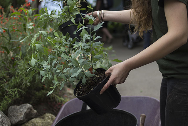
The second person I photographed at Eden was a gardener called Riyah Snow who works in the Mediterranean Biome. When I found her she was planting coreopsis maritima which she explained to me is a perennial plant that is found in the California chaparral and woodlands. I spent a lot more time with my subject in this shoot, asked her questions and showed a genuine interest in what she was doing. Because of this I think it made her a lot more comfortable to do what she would be doing normally, allowing me to capture photographs of her doing her work as if I wasn't there. 

Again I am really not pleased with the results of this shoot and am not sure if I will use this subject for my final images as I am unable to do a reshoot. My main issues are that I have not shown enough of her face in the photographs which I think is because I couldn't really get round to photograph the front of her with what she was doing. The compositions are really bugging me as well as I feel that with most of the photographs I have not stepped back enough to get Riyah in the whole frame, as all the images seem to crop parts of her out. Luckily I have the first shot of her stood further away which would help stop the images from looking too consistent if I did decide to put three of these together. 

For my next shoot I need to think more about composition and creating more space around my subject in the frame, so that the focus is more on them and I can get more context in the image through the space surrounding them. I also need to consider more the variety of images I can create with a series of three images being in mind as the final product. 

25/10/2016

Person at Work Shoot 1: Gavin V Thorpe


After researching contacts and the work of various photojournalists, I decided that for my own subject matter I would first see what shots of employees I could get while on our three day Eden   Project residential trip. The fact that we would have access to staff there presented a great opportunity that I really wanted to take advantage of, and it allowed me to learn a lot more about such an interesting, varied place. 

The first employee I decided to photograph at Eden was a hospitality worker, who was working on the Baobab & Rum Bar in the Rainforest Biome, called Gavin V Thorpe. I used the knowledge that I have gathered so far in my modules to communicate well with my subject and gain rapport with him in a professional way, in order for him to be comfortable while working to get more natural shots of him.  The nature of the small shack meant he was difficult to photograph in terms of framing and also working around customers in order to just or mostly get my worker in the frame. Because of this I don't think these shots are particularly successful and as I cannot go and reshoot them I will not be using this subject for my final images for this project. 

One mistake I think I made in this first shoot was not spending more time with my subject. As I was only there for ten minutes and if I had waited longer I think he would have been even more comfortable with me taking shots of him and also would have given me more to photograph in terms of what he was doing. 

I think I also need to establish what kinds of shots I should be trying to get in order to build my set of three images. As I think I focused a little too much on getting detail shots in this shoot which I feel should only be one image out of my three ideally, in order to see more of the subject themselves. In order to resolve this I plan on looking at series of photographs that show people at work, to observe what kinds of images work well when put together in a set.

Joel Meyerowitz Aftermath: World Trade Centre Archive


While looking through works of photojournalism that show people at work, I came across a book by Joel Meyerowitz titled Aftermath: World Trade Centre archive. The book contains photographs taken after the 9/11 attacks on the World Trade Centre in New York, where after a lot of effort Meyerowitz was the only photographer allowed unrestricted access to the area. Meryerowitz's personal account of the cleanup process and recovery efforts after the destruction of the twin towers, serves as a token of remembrance dedicated to those who lost their lives in the destruction caused by the two terrorist attacks. The book also celebrates the determination of those who rebuilt the area now known as Ground Zero.

I decided to look more closely at some of the images from this book that focus more on the workers rather than documenting the site's physical progress at that point, as they can inform the work I am doing at the moment a lot more. The photographs of workers from this series however particularly interested me, as they were working on what was an unparalleled cleanup operation in the US, after one of the most devastating tragedies of the 21st century. These images are incredibly powerful as they show such compassion and solidarity across those who worked on the recovery operation, and as these images span 9 months of work by Meyerowitz on the site, we are able to observe how these people adapted to this situation and really came together as one.

'A worker carrying a hydraulic hose'
Above is an environmental portrait that particularly stood out to me in the book, which shows a worker carrying a hydraulic hose at night on the recovery site. What is particularly powerful for me about this photograph is the very heavy feeling that it has. Not just in seeing this physical task being carried out but in particular the distressed expression on this man's face, as though he has been quite shaken emotionally. Which is something we can all have empathy for in the context of this image, as these men will have been working tirelessly all day while also finding remains of human beings and their work environments. As nearly three thousand people were killed in the attacks on the World Trade Centre and many of which were buried in the ruins of the two collapsed towers. Coming across these remnants must have been particularly disturbing and as the whole city was shaken by the events of 9/11 anyway, you can only imagine what it was like for these workers being confronted with the aftermath of this all the time. 

A lot of the photographs in this book by Meyerowitz show groups of workers together, and they communicate a real sense of the solidarity that they had in coming together to make decisions and get jobs done during this huge operation. However the photographs of individual people like this one above who are also part of this big operation, reminds us of how vulnerable the individuals must have been with being exposed to the aftermath of such a massive tragedy all the time. 

What I find particularly effective about this photograph as an image capturing a person at work, is the way this man is framed centrally in the image and takes up a lot of the frame, in what feels very confrontational for a viewer with the added context of the photograph. Forcing us to look into the eyes of someone clearly very affected by this tragedy who is doing their best to help. In terms of the task itself these leading lines created by the hose, coming into the frame on the top left and continuing down the image, communicates the physical demand required to do this task. The marks all over the man's clothes, the respirator and helmet all help draw our attention to the level of manual labour that was necessary for the operation and of course how unpredictable the site was. This is done effectively in the way the man's left arm goes up across his chest to carry the hose, cradling his respirator which captures our eye and then we begin to notice these marks and other details adding more context to this portrait. I also think having our attention drawn towards these common clothing items worn on a building site reminds us that these are normal people carrying out such an indescribable task under unprecedented circumstances. 

I think the vantage point that this photograph is taken at is another part of what makes this photograph of an unnamed worker so powerful. As because we are looking up at this man rather than straight at him, we get a real sense of courage and emotional strength that Meyerowitz and so many of us would see in people like this particular worker on the site.


Overall as a piece of documentary work this book is an incredible testament to those who came together on the recovery operation at ground zero and contains some incredibly potent images. In terms of what I have taken from this book for person at work inspiration, I really feel I am going to be more aware of things like vantage points and other details that can add even more context to photographs of this nature. In my series of three images I am able to capture three different perspectives of the same people at work and I hope that visually I am able to achieve photographs that inform the viewer well without necessarily having to read the captions I will be creating. Looking at Meyerowitz's photographs has given me a lot more to think about in terms of the story I am able to tell with my photographs. 

Joel Meyerowitz, 2006. Aftermath: World Trade Center Archive. First Edition Edition. Phaidon Press.

23/10/2016

Mike Lattanzi: Trades [Anonymous]


For my second lot of research I decided to look into more contemporary photographers who photograph people at work. To do this I browsed websites such as Lens Culture where I came across a black and white documentary project called Trades [anonymous], by photographer Mike Lattanzi.

Argentinian photographer Lattanzi set out to create this series in order to show that common occupations in everyday life still require skill, intelligence and mastery that can be achieved through practice. In these close up images showing simply the hands and the activities they are performing, Lattanzi intends to raise awareness of the manual work that we are very dependent on in our society, yet is very devalued in modern culture. I think this use of anonymity is very emotive and communicates how little we acknowledge the physical effort that goes into the production of things we use everyday.


Above is one of my favourite images from the series which shows someone's hands creating candy floss out of a machine. What I love so much about this image is the framing of the basin which sits well in the frame showing us these strands of candy floss going around the whole thing, really capturing the movement in the scene. The angle this image is taken at where we see the sides of the machine rather than directly inside, means our eyes are more drawn to this movement of sugar and the hands of the worker, rather than this serving of candy floss. Making us focus more on how this person interacts with their task which I think is really clever.

The use of anonymity in this series through only showing the hands of workers is really powerful in making us question who the human beings are behind these manual tasks. Which is really what the series wants you ask and have an increased awareness of in our everyday lives. The way Lattanzi captures hands in such a way that they appear delicate and caring of the task, communicates that what they are doing is a craft and is something that requires time and effort in order to master, no matter how much we take these processes for granted in the digital age. 

In terms of my own project work this series has shown me how powerful the detail shot can be in a series of images and also how effective it can be on its own as a singular image. Looking at Lattanzi's Trades [anonymous] has inspired me to consider the framing and movement more in my own images of this nature, and also how much hands can inform what is happening in an photograph and how a person feels about a task in a frozen moment in time, without having to see the subject's face.

Mike Lattanzi Trades [Anonymous]: https://www.lensculture.com/mike-lattanzi?modal=project-200710

Sebastiao Salgado


To begin my contextual research for the Person at Work brief I decided to look at well known photojournalists who have captured those at work in the past. I was particularly drawn to learning more about Sebastiao Salgado as I really loved his Genesis project that he created showing unspoilt landscapes, wildlife and remote communities, and was aware that many of his other photographs were taken during the industrial revolution, showing manual workers at that time. 

Before looking in depth at his actual images of workers I decided to find out more about the photographer himself and I have come to find him quite an inspirational figure. In terms of how he creates his photographic images and also how he came to be a photographer. 

The now Brazilian social documentary photographer and photojournalist Sebastiao Salgado originally pursued a career in economics and achieved a masters degree in the subject. He developed an interest in photography around the age of 26 and from then used black and white photography, to find beauty in brutal subjects of poverty, hardship and oppression in various cultures. His work serves to inform and raise global awareness of varying human conditions, which is presented through his well known books, such as Other Americans which was published in 1986. Which shows photographs from his nine year study of well known culture in Latin American. Salgado is known for being a very intense person who is involved deeply in political activism and I think it is really interesting that his work has such purpose to it, and how he makes use of the power of the visual image and the responsibilities that come with that. 

I have been reading Salgado’s seminal book titled Workers which was published in 1993. The book is beautifully curated and contains photographs of workers in places such as mines and commercial fisheries. Revealing the harsh conditions of these large scale industrial sites. 

One photograph that really grabbed me is the first double page image we see of gold miners in Serra Pelada, Brazil. The photograph is one in a group of 28 photographs that Salgado took of this North-West Brazilian Mine in 1986, where he lived with the workers and observed them for several weeks. 

The photograph was taken at a time where Brazil was experiencing a gold rush, and Salgado said he witnessed around fifty thousand workers who laboured at Serra Pelada while he was there. Who were each making as many as sixty trips down the cliff and back per day to carry sacks weighing around thirty to sixty kilograms. This image was taken at quite a distance by Salgado and despite being so far away, these multiple directions we see these streams of people entering the frame of the image, suggests that this is only a section of a vast area of mining. I think the scale is particularly interesting in this image and that he made the decision to take the photograph so far away, because although Salgado is evidently not a minimalist with his subject matter, a lot of his images possess a very minimalistic quality to them. In terms of this photograph these huge numbers of people are framed in such a way that reduces these stream like shapes of people into larger clusters of more singular forms over these rocks. 

I find this image particularly powerful as the distance it is taken at allows us to peer into this scene, taking in all these tiny details, in this vast chaos that would be everyday working life for these people at this time. What really stands out to me is the way there are channels of people taking these sacks up to the top of the mine and then back down again, and with the scale they appear at in this image, these workers bare resemblance to herds of animals we see in photographs taken of the African plains. I think this is particularly emotive as these people will be working for 20 cents per day and they are so dehumanised in the way they are treated like animals to do these repetitive yet massively strenuous tasks. The way Salgado has captured these people really reflects the conditions of the manual labour for those in poverty at this time, and the nature of this photograph forces us as viewers to be confronted with these working conditions, with the numbers we see experiencing this careless operation. 

Another photograph I find really interesting by Salgado is this image taken in Bangladesh where he immersed himself in observing ship breaking. Where workers would take apart old ships, once mired in the mud by hand using cutting torches. Which is still very dangerous manual work being done by those in poverty in Bangladesh and other middle Eastern places today. 

This photograph shows the great deal of immersion in worker culture that Salgado is able to achieve and patience he used in waiting for these perfect moments to capture, and as well as being able to compose an image brilliantly he makes skilled use of the decisive moment. Which in this case is this single human figure in the foreground shadowed by the remnant of a huge ship in the background. This gives a real haunting feeling to this image. As though this is some kind of calm after the storm for this worker, walking away from this dark metal structure, where he is likely to have spent hours doing gruelling work to help take this structure apart.

This photograph in my opinion is a great example of Salgado’s individuality that he maintains with his work. In terms of these unique compositions and ways in which he has been able to capture these workers. He also has a very recognisable style to his work during this era of photography through the use of high contrast with lots of grain, which emphasises more simplistic shapes, depth and texture, in his often more complex subject matter. I think these very dark areas which are emphasised in his work also create intriguing areas of negative space against the more grainy, textured elements of his photograph. Which I think are particularly powerful in these images of big structures like these old ships, the shipping yards themselves and the mines he has photographed. As these heavy shadows really evoke a haunting sense of the how it was in these inhospitable environments these people were working in. 

Overall I find Salgado’s approach to photojournalism and social documentary photography very inspirational, and it has really made me think a lot more about the different ways I am able to capture workers in my own work. Personally I really like how Salgado used his work to explore social and economic conditions in different environments and that he uses his photography to communicate messages about the world. I also admire his sheer commitment to photojournalism and even though he insists he is a documentarian and not an artist, I think his work’s individuality in terms of style and composition is highly commendable. 

Images taken from: Sebastiao Salgado, 1997. Salgado, Sebastio, Workers,. New edition Edition. Phaidon Press.

18/10/2016

Person at Work : Rationale


For our first official assignment we have been given the task of creating ‘3 different compelling images of 3 different people at work’. They have to be shot digitally, in ambient light and in RAW, with no cropping to be done in post production. 

When I read the brief I was slightly overwhelmed and felt daunted by the task but I now feel excited as I feel it will be allow me to dive right in and apply myself as a working press photographer would to a shoot. In terms of compiling ideas and research and establishing relationships with my subjects in order to communicate a story with my images. 

As you can see on the sheet of paper shown above I have started brainstorming ideas to do with possible interpretations of the word work, and also what kind of jobs I would be interested in learning more about. As taking photographs of people doing those jobs would feel even more purposeful to me. 

In terms of interpreting the word work I have decided to not limit myself to work that solely suggests employment and also consider work in terms of an act that involves any kind of effort to achieve a result. This could be in the form of a creative pursuit of some kind or project that helps the community. I am however yet to research into these particular ideas.

So far as you can see after looking at lists of different sectors and job roles I have narrowed down areas of employment that interest me down to three key areas that I have made small mind maps from above. They are those involved in food, arts and ‘animals, plants and land’. I find myself particularly interested in possibly photographing a fisherman or someone who cooks seafood locally in a restaurant, a pasty or fudge maker, a florist or a local artist or curator.

My next goal is to look more into local projects and artists and to find potential subjects in the local community who fit the job roles I am interested in. I think it will be a lot easier to find artists and those who run small businesses online and I should be able to contact them by email or telephone. Otherwise I will have to pop into the premises of where they are based and ask if I can pop back, which if they say yes will help show my interest and build a repport with them more easily beforehand.

I also plan to research some photographers who have photographed people working to learn more about how I can go about photographing this kind of subject matter. As at this stage I’m really unsure about how to achieve consistency with a series of this nature and also how to effectively communicate well the context of the work these people do, through the three pictures I will have to narrow my shots down to in order to be assessed.

15/10/2016

The Fish Factory


For our first brief (The Postcode Lottery) we chose random postcodes out of a hat and were tasked to photograph the exterior and interior of that location and also get a portrait of someone working there. 

The Fish Factory is an art venue located on the first floor of an abandoned scallop factory on the Falmouth Waterfront. In 2011 Rose Hatcher took over the warehouse in order to create an independent gallery, artist’s studios and an event space. The intention was to create an accommodating and affordable hub for local emerging artists, students and graduates seeking to continue their practice while based in Cornwall. 

We spoke to volunteer Robert Burns and took a portrait of him for our brief. He explained to us the challenges of running a DIY grassroots art space in a temporary premises, and also the connections the space has with other’s in Poland. Their newest exhibition which has just opened on the 16th of September features work from four artists who are based in the Tri-city Pomerania. It is called Associated Territories and consists of drawings, paintings and batiks, to explore how artists despite their individual pursuits can collaborate creatively. 

Overall I think the shoot was successful however we did struggle to get shots of the exterior as the property is owned by a firm who only gave us permission to photograph the back of the building facing away from the seafront. Which had a lot of cars parked outside, which I didn’t think helped show the real character that the old building has.

My favourite photograph from the shoot is the one looking down into a doorway with the ssbong sign as you walk into the artist’s studio space. I like this one because I feel it evokes the kind of atmosphere that the place has with the glimpses of the original factory space on the roof, and then with all these divisions and objects that the artist’s have brought in to accommodate the space.

28/07/2015

Taylor Wessing Photographic Portrait Prize 2014 // Review

As a northerner it is easy to feel isolated and removed from the happenings of our capital city here in the UK. Particularly at the moment, there are many discussions and debates taking place about how London values the northern half of Britain, and how much of a priority and a say we really have in regards to our government. As someone who is passionate about art I feel very fortunate this year especially that we are never short of culture across all parts of our island, as the Taylor Wessing Portrait Prize 2014 arrives in Sheffield. It is here from the 2nd of May to the 16th of August, and is the only place where you can see the 59 shortlisted photographs from the 4000 entries of the 2014 Taylor Wessing Portrait Prize, outside of the National Portrait Gallery in London. 

The exhibition is taking place in the Millennium Gallery, which is at the heart of Sheffield and has a reputation for being Sheffield's premier destination in displaying art, craft and design, and houses work reflective of Sheffield's heritage, particularly in metalwork as well as art and design exhibitions showing contemporary works of art. 

The prize itself has become an annual fixture in the National Portrait Gallery's calendar, and has built a reputation for reflecting and featuring some of today's brilliant and emerging photographic talent. The images shortlisted cover a wide range of traditional and contemporary approaches to portrait photography. The exhibition includes highly conceptual pieces of work, revealing images of famous faces, intimate photographs of friends, family and much more. What I particularly loved about the exhibition was the vast range of styles of portrait photography that really reinforced my appreciation for the discipline, and I also left feeling incredibly inspired in terms of my own personal photographic pursuits. 

Konrad Lars Hastings By David Titlow
From reading reviews and talking to other people about the exhibition, I found a common theme of criticism if you will for the judge's take on what exactly a portrait photograph is. The winning photograph by David Titlow could easily be challenged for not necessarily meeting the definition of portraiture, in it's including of three adults, a baby and a dog. On this alone some would argue, and I am inclined to agree, that this image has more of a documentary nature to it with its narrative of the morning after a large party with this intimate scene we are witnessing, of Titlow's wife and child along with friends. 

However it is hard to dispute this image's incredible quality and presence with the dreamy lighting and tones similar to that of the Golden Age of Dutch Painting. I personally find it very emotive and heartwarming in how the lighting gives the child such an angelic quality, which you can imagine is exactly how the photographer perceives their child. This quality conveys a real sense of preciousness that the couple see in their child which we all would do, which is reinforced by the mother's locked gaze on the animal that is being held incredibly close to her child. The photographer you can imagine is distracted by this playful scene between the animal and their child which they are intent on capturing, and this is very uplifting of course. Whereas the mother juxtaposes this completely with her alarmed expression and the way she is holding the child, very much prepared to quickly move them away should this peaceful scene be shattered by any aggression from the dog. 

As beautiful an image as this is, again it can very much be questioned on it's place in a portraiture exhibition and competition. However I do think the judge's are intending to play on the definition of portraiture to create a certain impact and really make you think. Prizes as big as this can be used as a platform to convey messages and ideas about a discipline, to impact very much how artists approach their subject matter and what is considered appropriate to that genre. In this situation I believe that the judging panel are twisting this idea of portraiture, in it being solely about representing a single person's likeness and personality in an image of them, and is instead referring to this idea that portraiture is in fact a way of representing the photographer rather then the subject. Through this image by David Titlow we can see very much what is definitive of him as a person. We can see his loved ones including his child and wife, with her old school friends back in Sweden where she is from. The image was taken on a camera that is very personal to the photographer as he has been using it to capture personal shots for years. From this we could argue that this photo is in fact a representation and therefore a portrait of David Titlow, rather than the subject matter I've commented on previously. 

Overall the exhibition felt more of a celebration than a commiseration to those who were shortlisted, with the winners by their side. There is a real sense of achievement in every image displayed that is there for us to appreciate, for their unique take on the discipline. I could spend a hours taking you through the entirety of the 59 pieces of work displayed, but instead I want to draw on some of the key themes I picked up on in terms of the curation of the exhibition, as each corner I turned seemed to reveal a new layer to the types of portraiture shortlisted. 

Boy With Stick Gun Playing World War III (Russia Versus Ukraine) By Margaret Mitchell
The Unsettling 
Some of the earlier images I came across in the exhibition were very haunting in communicating a wider narrative outside of the image itself. One of my personal favourites is the photograph above by Margaret Mitchell, which shows a young Russian boy out of a number she found playing with sticks. When she asked what they were playing they replied with the title of the image shown above. This is very emotive in reflecting these events that are happening in their society that are being fictionalised into the children's games. I think this is so powerful because violence and war is something that no one would want their child to grow up around, and as much as you may try and shelter your child from this kind of thing, children still know what is happening. 

I also found instantly when coming across this image that the context wasn't necessary to trigger an emotional response, and this is what I found with many images in the first part of the exhibition and that is why they clearly deserve to be shortlisted. As the real skill with creating visual art is being able to communicate something specific and trigger a certain response in a person, without needing anything else and for viewers not needing to ask too many questions in order to understand and interpret a piece of art.

Lenny Henry By Sarah Lee
Famous Faces
As you would expect with any major portraiture competition, there is a fair share of recognisable faces. However those that are shortlisted have a fundamental quality, in that they reveal something new or show the person in a way we are not used to seeing them. The image above of Lenny Henry was not actually placed with the other portraits of famous people and this is because it has a different purpose and is more conceptual, in that it was commissioned by the Guardian to accompany an article about the under representation of black and ethnic minorities on British television. Because of this the photograph is not so much to show this more vulnerable side of Lenny Henry as it may seem, but to in fact communicate this concern and worrying issue that Henry clearly feels very strongly about. 


Stella By Michele Aboud + Natalie Angel Miranda By Viviana Peretti
The Elegant
With many portraiture exhibitions you can expect an array of very pleasing images to look at in terms of showing the beauty and elegance in their subject matter. My personal favourite among these very graceful images of couples, drag artists and more is Stella by Michele Aboud. Which is a very simple but gorgeous image by Aboud taken of her neighbour Stella. I think the incredible use of tone and lighting is what makes this very simple image of this obviously very pretty woman, such a stunning portrait.


One Minute to Go By Robert Timothy + The Inheritance Project By Hayley Benoit


The Conceptual
Some of my favourite images among those shortlisted were those that were more conceptual or part of a larger series of work. One Minute to Go for example by Robert Timothy is part of a series that records newsreaders through portrait images in the last moments before they go live on air. Another image among these more conceptual pieces was a portrait photograph taken from a series called the Inheritance Project by Hayley Benoit. This series shows people styled to resemble old photographs of their parents. I find this series really intriguing and really recommend taking it a look at it, as the use of fashion really blurs the lines between generations and offers a fresh perspective on the act of children dressing up in their parent's clothes.

Drying Off By Chris Frazer Smith + Unexpected by Lenka Rayn H.
Children
Many of the brilliant photographs in this exhibition include children. Some as you would expect offer a more lighthearted and silly perspective on childhood, whilst others including the two images above have a more serious tone which the photographer has managed to capture in the children. Which is what I think makes these two images in particular so special. The image on the right is entitled Unexpected and is one of my favourite photographs from the exhibition. The photographer as they have shown through the title of the image, managed to capture something very surprising in this one of the two children they photographed. Many photographs of young girls as you'll know, don't come close to achieving the seriousness of expression that this subject has, and personally I think this emotion and even the slight pain we can see through this girl's face is really quite moving.

Arvi By Sami Parkkinen + Dog and Boy By Lawrence Cartwright
The Chucklesome
Many of my favourite photographs in the exhibition were some of the most witty. Two of my favourites of these images are above and play in particular on what being a child is and make a comparison between children, adults and animals. I went around the exhibition clockwise so I finished with these more heartwarming and uplifting photographs and they really rounded off what otherwise was quite a serious collection of photographic images. The winning photograph by David Titlow was also among these more youthful and soul lifting pieces of work.

Felix By Tracey Howl
Before I finish this review I just wanted to share my personal favourite photograph from the exhibition which is Felix by Tracey Howl. Aside from the rich tonal quality and the exquisite framing of the boy and his horse, what makes this image so special for me is this very special relationship we can see between the two subjects. I think the way Felix makes what is a very powerful creature seem so gentle and modest is very special, and to see this obvious affection and strength in this young boy is very uplifting to see. Both the horse and Felix are so striking with their beauty but what I really find the most powerful in this image is the contact we can see between the nose of the horse and the boy's hand, and also the way Felix doesn't feel he needs to keep an eye on the horse showing the strong amount of trust this boy has in this creature. I think I find this image so touching because it represents something that I think a lot of us desired as a child. Whether it's a close relationship with a pet or a mythical creature, I think as a child for me personally this kind of relationship with a creature was something I could only imagine or only experience through films and books.

Overall this exhibition of the Taylor Wessing Photographic Portrait Prize 2014 in Sheffield offers a well rounded but complex exhibition, which explores an abundance of approaches to contemporary portraiture photography. I really recommend a visit if you happen to be in the South Yorkshire area. To leave you with a thought that this exhibition creates, I want to draw on just how common it is in a lot of the work displayed to feature someone close to the photographer and who is therefore more comfortable a subject to use, and also to consider just how many of these photographs are very carefully staged rather than being spontaneous in nature. Considering that many portrait images that seem to be of this nature have been shortlisted, do you think these components are important in creating a successful portraiture photograph?

12/04/2015

Exam Evaluation

When given the exam paper at the beginning of the project, I decided to choose the word flicker. I chose this because I really felt it was the most challenging word as an initial stimulus, and I really liked the idea of using it to explore more abstract forms of photographic work. Which I was really wanting to look at, as I'm definitely more interested in the fine art side of photography, which I haven't had that much of a chance to look at so far, during my AS Level studies. 

For me the most interesting part of this whole project, has been doing my contextual research and really learning more about the conceptual work I have come across, that has really fascinated me. I've also really loved taking inspiration from sources, that I've personally connected to and come across myself. For example really looking into the visuals of a horror film I enjoyed and learning about a singer's lyrics and the deeper meaning behind his music. Which is something I never would have previously considered applying to and using as inspiration, for my own photographic work. 

The new techniques that I've come across in this project, have really fuelled my love for really minimal, conceptually strong works of visual art. Acconci and Schneider's methods to me are just so incredibly clever, despite being relatively simple, and applying this to my own work has really provided me with a completely new perspective, to going out and simply taking photographs and putting together visual imagery. A new technique I tried in this project was overexposing my photographs on purpose, which created some really interesting abstract images. Which inspired me to think more about how I can create minimal and surreal photographs, which focus on form and composition, rather than colour and detail. I also came across the technique of creating luminograms, which I discovered by looking at some of Wolfgang Tillman's abstract work, such as Blushes and Freischwimmer. I really loved the effect of this drawing with light onto photo paper, and would love to try it in some future work. 

During this project I researched a number of photographers and artists to gather inspiration for my final piece of work. This included painters such as Andy Denzler and Francis Bacon, to photographers such as Gary Schneider and Angelica Garcia. I also looked at video imagery from the 2002 remake of The Ring and Marilyn Manson's "I don't like the drugs", music video. As well as individual artist's visual work, I also researched The Adventures of the Black Square exhibition, currently on at The Whitechapel Gallery in London, and looked more closely at Malevich's black square and Dora Maurer's conceptual work.

I have to say that all the sources I have looked at during this project, have influenced my final piece massively. This is because my research was very sequential in that I generally transferred from one source to another, due to either the way they have inspired me, or that their work has been associated with something else. In terms of my final photographs specifically, I was heavily inspired by the entire premise of the black square and the exhibition at the Whitechapel Gallery. I was also really inspired by Maurer's use of hands in her exploratory work and also the anonymity in the film stills I looked at in The Ring. The use of the white noise was really inspired at first, by Andy Denzler's video tape style paintings. I loved the message he conveyed in regards to maintaining the shelf life of this older technology, as newer technologies are growing and developing so fast. This work really made me think about the flickering of computer and television screens, which really brought me onto this idea of using white noise to convey something much deeper with my work. 

Personally I couldn't pinpoint one specific part of my project, that I think was the most successful. I really loved my overexposed experiments, which is why I have displayed three in a frame to go alongside this exam work. As I just love these abstract images and the minimal and compositional value that they have. I also am really pleased with my final piece, now that I have put it all together. At first I was panicking slightly that my idea was maybe too simple and maybe too ambiguous for a random person to really respond positively too. As it is more about what these images represent, rather than they're beauty. But now that I've put them together in their frames and also onto the website I created, I am proud of what I've produced conceptually in this project. I picked this title because I thought it was the most challenging and I am pleased with what I've managed to get out of a more obscure stimulus. 

I'm also really pleased with how my criticism and writing has come on during this project. When I started my other coursework back in September, I was really unsure how to write about photography and art, and how to really respond to work that is not my own. But through reading articles and books during this exam work, I really feel that I can use artistic vocabulary, more comfortably and really explore ideas and analyse work through my writing.

Problems I encountered during my project, mostly were to do with the time constraints that I had to do this work. As I really feel like a few more weeks would have helped me develop my final idea even further and to have more time to do it would have been useful too. I also had time issues on my London shoot as because I was on a trip and we also arrived late, I really didn't have enough time to get the shots that I wanted. 

Having the time issue with my London work, really helped me decided my final piece. As I knew trying to get really clever shots using interesting backgrounds, would have been too ambitious in the 5 hour duration. Which is why I decided to take more of a minimal approach to my work and focus more on how it would be displayed and edited, rather than the actual photo taking.

If given the chance to complete this project again, I would love to experiment with creating collages. As I think that this technique might be a great way to incorporate my white noise and black square cleverly into an image. I also would have liked to have created some darkroom experiments, inspired by Wolfgang Tillman's luminograms, and maybe have experimented with photograms to incorporate the black square into an image that way.  

Overall I am pleased with the work I have created during this project, and feel I have really developed in terms of my writing and my ideas about my own personal photography, from the work I have looked at. I think challenging myself with the word Flicker from the exam paper, really gave me the opportunity and confidence, to be more ambitious with my subject matter in this work. Which has just given me a completely new perspective of photography. This project has by far had my favourite themes in during AS Photography, and I think it is going to really influence my future work, not just in A2 but my own personal work in the near and distant future. 

My Final Piece // Flicker


Above is my final piece, that I assembled after choosing my three edited photographs to go into my small rectangular frames, that fit my printed photograph's 6x4 scale perfectly. Overall I think the composition of my piece is strong, with the high contrast between the shadows and highlights, both in my images and the frames. Which really emphasises the black square as a piece of symbolism for abstract art. 

I decided not to use any of my cropped images in my final piece, as I want the square to fill the photographs and really dominate my images, to really trigger a response for a viewer to my white noise obstructed square. Which hopefully as a conceptual piece, will be really thought provoking and hopefully challenge these ideas about the technologies effect on art in the past century.

Dora Maurer's conceptual work very much inspired the use of hands and anonymity in this piece and I think they work well in communicating this exploration of these ideas, in a way that makes this piece very introspective for a viewer and really asks for their interpretation. The hands for me also work as a metaphor for arguments, regarding the premise of the black square and how we can interpret it 100 years later. 

Like in my London photographs I made these images black and white, in order to make this link between old and new, in reflecting this passing of 100 years of the black square and it's original ideas and premise, compared to where we are now. With the technological developments that have grown so much over the past century

The white noise in this image, in it's contrasting round shape to the square, really represents what I've looked at in this project, in terms of distortion and time and in this piece it really reflects the passing of this growth of the digital age. As analogue televisions where visual white noise originated from, seem rare now that digital television has become the norm and technology has developed so much since then, in this relatively short space of time. 

Overall I am pretty pleased with my final piece. Although I do feel that, if I had more time I would have been able to create something, slightly more reflective of my own personal style of photography. As this was heavily inspired by the specific work and techniques that I have looked at in this project. In terms of the word FLICKER, this piece to me really goes back to these ideas I gathered from looking at Vito Acconci's work. From his blinks piece I really responded to it as a reflection of what blinking actually represents in our lives, in very much being like a comma, and that there is so much we miss simply because of blinking. For me in a similar way, this white noise represents what we miss and what obstructs our daily lives, simply because of this dependency on technology in the 21st century, and also the way it takes away from traditional aspects of our culture such as performance art, and traditional forms of artwork such as painting. Which is why I think the black square as well as this anonymity and use of hands to hold this white noise, is important in challenging these further ideas about time and technology. 

I also decided to share all my possible images for my triptych, on a Tumblr website that I made specifically to display this work. I decided to create an online display of these images, as it does seem appropriate considering the main theme of this work is to challenge the technological age and it's effect on both art and our daily lives, and the internet is very much at the forefront of the themes of my work. I have also created a page on this site where I have written an artists statement, to explain my work to the public and to make it more accessible for them. I really enjoyed creating this site and my statement, because it's allowed me to present my work as if I am a creative professional, and really helped me take my work seriously in having to justify it in my statement.

Creating My Final Piece


For my final shoot, I made sure I took my photographs on a day where the natural light would be bright enough, so that I could use a plain wall inside, as a background for my photographs. It didn't particularly matter to me that the wall was slightly yellow, as I planned to edit my images so that they are black and white. To take the photographs, I positioned my camera on my tripod and instructed my female subject to hold the square in a variety of different positions, so that I would have plenty of choice when it came to editing and creating my triptych. 


To create my circle of white noise to put onto my images, I used a circular cut out effect on a piece of online photo editing software. This made sure that the surrounding area of the circle would be completely transparent, making it easier to layer on top my black squares. Once I had put my circle onto around 30 of my favourite images from the shoot, I edited them so that they became black and white, and then I printed them so that I could begin arranging and working out the three images I wanted to use for my triptych. As well as using the full images I had taken with my camera, I also cropped some of my photographs, so that the square would go off of the page, to see if these more abstract effects would add something to my final triptych.


Above are some examples of experiments that I tried out, with different images and arrangements for my final piece of work. After a few experiments with landscape triptychs, I decided that for me visually, having the images on top of one another is a more effective layout, as the images feel more enclosed together as a piece, rather than three separate photographs.

Summarising My Inspiration + Final Piece Exploration

I've completed a lot of contextual research and exploration throughout my exam project so far. I've decided to summarise everything I've looked at, in order to collate the inspiration that I've taken from the sources I've looked at, and to help come to some conclusions about possible final pieces, that I could do for this project. 

My first source of inspiration came from choosing the word flicker, as a stimulus from the exam paper. I put together a mind map in order to explore my stimulus and decide a course of action to take with my research, in which I decided to look at light and movement in relation to the word flicker. In order to find inspiration, I looked through a number of photography books, and in a book I own about contemporary photography, I came across a series of abstract work by Wolfgang Tillmans. I was instantly taken by this work as it is so abstract, but manages to convey so much emotion, by the powerful use of movement in the large luminograms. Looking at this work really made me think about movement and how it can be used in an image. It also made me think about the effectiveness that a more minimal style can have in a piece of work. 

In the same book I then came across Gary Schneider's head series. I found this work really unique and his conceptual ideas fascinated me. As his technique of taking his images is so different but really effective in conveying so much character and emotion from his subjects, despite being a still image. In the book it said that Schneider was very much influenced by Vito Acconci's conceptual work, which I decided to look at next. In particular I looked at Acconci's conceptual piece of work entitled blinks, where he walked down a street and took a photograph every time he blinked. I found this work the most inspiring that I'd looked at so far. As it really challenges what it means to be artistic, is so conceptually strong and the blinking to me really relates to this idea of flickering. It really made me think about what my images could possibly represent by the different techniques I use. Not just in my exam work but with my photography in general.

I then came across a book on Francis Bacon's portrait paintings. I decided to find out more about his self portraits in particular, as they are so raw and really show this use of distortion and movement that Bacon uses. These distortions are really quite powerful in these works, in conveying this psychological torment and despair that Bacon felt for much of his life. For me Bacon's self portraits inspired me to think about distortion in photographic imagery, and the use of smaller movements to communicate darker, more psychological themes in an image. The way Bacon has used triptychs so effectively to explore more that one side of his subject, is really making me consider using a triptych for my final piece of work as well, in order to explore the themes I'm looking at even further. 

After looking at Bacon's work I took my research online, and on an art blog I came across a really interesting series of work by Angelica Garcia, entitled emptiness. Like Bacon, Garcia used distortions in her hand treated photographs, which really communicated well her conceptual idea of representing how memories change of the people we once knew, and how tragic time can be over the course of our lives. Finding out about Garcia's intentions with this work, inspired me to think more about the possible social messages I could communicate with my work.

On another art website, I came across a series of paintings by Andy Denzler, where he used video tape effects, to create these glitch style paintings that I found really poetic and intriguing. They really made me think about the word flicker in relation to technology, such as computer and television screens, and they inspired me find inspiration relating to television distortions and darker themes. This led me to looking at stills from the 2002 remake of The Ring. As I remembered a photograph used in the film, that like Bacons paintings used distortion to communicate something very dark. Looking more at the photograph, and other stills from the cursed tape and film in general, inspired me to think about maybe using anonymity in my final piece. Which in the stills I looked at was very powerful in communicating something a lot darker and important, than the actual subject matter of the image itself. The film also inspired me to think about using more monochromatic colours in my work, and textures such as white noise to convey something more psychological and conceptual with an image.

I then looked at stills from Marilyn Manson's, "I don't like the drugs" music video, which through looking at the imagery and lyrics, really gave me some conceptual possibilities for my work. In terms of looking at social institutions and using my work to maybe challenge some of these structures that affect and control our everyday lives. In particular with mass media as it really relates to what I've looked at in terms of video tape imagery and white noise. 

Researching and looking at The Adventures of The Black Square exhibition, that is currently on at the White Chapel Gallery in London, has inspired me to look at this symbolism of the black square and geometrical obstruction. In particular in using it to communicate my thoughts about art and technology, now that a century of the black square is over. As the past century has seen so much change in terms of digital art, technology and mass media in general, which has effected art and everything around us.  

Through concluding all of the inspiration I have looked at so far and possible ideas I have thought about for my final piece. I decided that I would create a series of collages out of some of the iconic pieces, from the Adventures of the Black Square. I decided to replace some of the geometrical qualities of these images from the exhibition with white noise. In order to comment on this idea of the black square, in relation to what the next century holds for modern art. We are at a completely new place with art and technology than we were 100 years ago, and I would love for my work to effectively challenge and reflect this change and rise in technology, and really question whether this is good for us or not. Not just in our daily lives, but also in modern art with the development of digital photography and computer graphics, and whether this developing of our culture is good for us or not. 


I decided to create this effect with the pieces from the exhibition digitally, by covering specific areas of the artwork with the white noise effect, that I took with my camera from my own television. I made the images black and white, as this effect is more commonly associated with older imagery because of old means of photography and video. I also wanted to use this to challenge the idea that these are contemporary art pieces, when digital art and technology has grown so rapidly over the past century.

Overall I do like the result of these images, however for me they are not personal enough and really do not reflect the ideas I have looked at and gathered in this entire project. I also think this is too specific a response to The Adventures of the Black Square exhibition, for me to really use this as my own photographic response to my exam stimulus as a whole.   


I then decided to look at how I could personally interact with my pieces. To show a real personal response and reflection to the work and ideas that I have looked at in this project, in terms of art and technology. Above is a series of experiments I conducted inside, using the flash on my camera, where I held my edited pieces from the black square exhibition and also pieces of technology. I used the timer on my camera, with a remote and my tripod, in order to position myself in front of the frame before taking the photograph, so that I could better set up the composition of my images. Doing these experiments was really for me to test out what I could do with my collages, and technology such as phones and cameras. Dora Maurer's work such as Etude 4 and Seven Rotations, really inspired me to use my hands and try different positions of holding the objects, in order to represent my own reflection and personal response to the subject matter. Also to demonstrate this exploration I have undertaken, with the themes and ideas I have looked at in this project.

From conducting these experiments and exploring the theme of the black square as a stimulus for my final piece. I have decided to incorporate the ideas I have gathered throughout this project. Including time, technology, art, mass media, and this use of the black square. Which I think is the perfect symbol to represent and challenge the ideas I have, regarding time and the growth of technology and mass media, in relation to art and the everyday. I also want to include white noise, in a way that obstructs and challenges the black square in my image, to really make a powerful connection between where we are now and back 100 years ago, and to challenge whether these advancements and changes have been good for us or not.

I have now decided that inspired by introspective work such as Francis Bacon's, "Three Studies for a Self Portrait". That I will create a triptych of three images as part of my conceptual work. The subject matter of my photographs, will be three different positions of two hands or a single hand, holding up a black square, in front of a plain background. I will then digitally place a circular image of my white noise, in the middle of these black squares. Which being circles I think will help communicate this challenging and obstruction, of the idea and structural value of the black square, and this starting point of where we seem to be now, 100 years later. With the growth of technology and it's impact on modern day art.

For me using this more minimal approach, which I've really loved about a lot of the work I've looked at in this project. Is important in exploring this symbolism of the black square, and in using this surrounding negative space, to really emphasise my subject matter and really make my work more intriguing and thought provoking. Which I really felt my London images lacked, as I tried to make my work more accessible for anyone to look at, which really took away a lot of depth in the image and effectiveness of the use, of the symbolism in my opinion.

To prepare for my shoot I will be finding a subject to hold the square, that I will be cutting out of black card, a light coloured wall to take my photographs against, using natural lighting to make my subject's hands and the card look more raw. Which I think will really add to the more minimal aesthetic to my images. My images will also be completely black and white, to really emphasis the high contrast I would like to create, between the highlights and shadows in my photographs, which should really bring out this symbolic black square further.

In terms of the position of my subject and the way the square is held, ideally I would like to create this almost surreal, two dimensional effect with the square being held very much straight up, facing my camera which I will be positioning on a tripod. This is so I can better frame my images to perfect their composition.

To display my three chosen images for my triptych, I will be buying three small black frames. As I visited an exhibition at the Tate Liverpool a few weeks ago, where an exhibition of Gyorgy Kepe's photographic experiments were being displayed, and a lot of his work was displayed individually in small black frames. Which I think is a really effective way to display a series of work, as the pieces feel sequential, but also individually powerful. Which is a quality I'd really like to give to my three images.