After looking at William Eggleston's work I grew fascinated by his clever use of colour and began researching other colourists, leading to my rediscovery of the work of Saul Leiter. After dropping out of his studies to become a rabbi Leiter moved to New York to pursue painting and was later encouraged to try photography. Being a part of the New York School of photography, Leiter's early work in the 1940s and 50s was mostly photojournalism and fashion photography. As his commercial work was being printed in publications at that time the photographs would usually be replicated in black and white. Meaning the earlier work we associate with Leiter generally consists of black and white photographs.
It wasn't until later in the 1990s that Leiter was discovered to be one of the most important colourists since William Eggleston. As he had kept his personal work hidden which consisted of the fine art colour photography we know him for today.
In his study of colour Leiter's subject matter mainly consisted of dense urban life. To get a richness of colour and different tonal effects in his photographs he often used film that was overheated or past it's expiry date. Which provided a very experimental element to his work much like in his abstract expressionistic paintings made with gouache and watercolour.

Abstraction is something Leiter plays with often in photographing interiors and exteriors and many examples of this are in his early black and white photographs. Where he began to play with the compositions and depth of field in his photographs, experimenting with focus created by the lens on subject matter. Many of his photographs were also taken of reflections or through various glass distortions such as condensation. Thus making the context even more ambiguous in his images. This ambiguity created by having subject matter cropped mostly out of the frame and distorted with depth of field, is what makes Leiter's images so captivating. As for example in the photograph above titled Basement, 5817 Beacon Street, there is a really engrossing sense of mystery created by not being able to see outside of this darkly lit window.
The two images above interested me because there are quite a number taken of this scene by Leiter as he clearly spent a lot of time waiting for new things to enter the frame in these experimental photographs. We can also see how he has had to rewipe the fog with his hand to reveal a more detailed view of the exterior through this window. The photograph of the man with the yellow lorry is my favourite of the two and is a great example of the kind of minimalistic style used by Leiter to create what feels like more of a collage than a photograph. He has used this yellow accent of colour as an anchor in the image which compliments the tones on the man's hat for example and the abstract text which feels as though they have been stitched into the composition by Leiter's frame.
What really interested me in looking at both of these images is how different they are in terms of colour tones in both of them, and despite being framed similarly with the text slightly cropped out of the image and the same building in the background. They both are completely different photographs in how we read the warmth and focus points in the compositions.
Another thing that really intrigues me about the way Leiter composes his images is the way he makes use of cropping and uses a portrait orientation for his photographs. I think that both of these features in his photographs provide a really interesting height to his compositions which creates a mild sense of distortion for a viewer. As we are used to viewing urban landscapes with our wider, expansive human vision.
The above photograph particularly interests me because of the way this red accent created by the umbrella is cropped mostly out of the frame. Leiter makes great use of splashes of red in his photographs which is the colour most sensitive to the human eye, and without these striking accents of bright red in his photographs like in the one above for example, they would be completely different photographs. We would also read this as a completely different image if there was more of this figure and the umbrella in the photograph. As the subject matter of the picture would then concern the figure in the snow rather than the intended context which is the urban landscape.
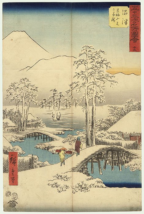
As well as these bright accents of colour in Leiter's images he also makes use of the desaturated tones created by the out of date and often overheated film. The muted colours acting as almost negative space visually against these bright accents of colour, references how Leiter was influenced by Japanese Woodblock Paintings. Which were particularly prolific in the Edo period of Japanese history, and were characterised by their use of white negative space with more concentrated areas of colour in select areas of the image. Usually to highlight people and the water and sky in the paintings.
Looking at Leiter's work has made me think a lot more about what my colours can convey in my photographs and how I can use compositions, to communicate about something exterior to what is literally shown in an image. In particular with my interior shots, looking at Leiter's work has made me think a lot more about colour palettes and shapes I can compose within a frame.


No comments:
Post a Comment